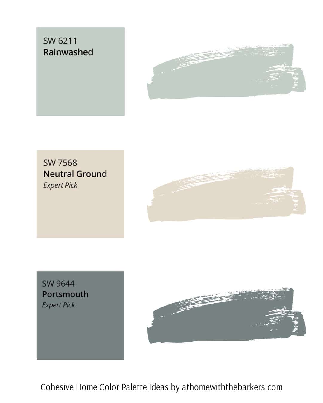
Sherwin Williams Rainwashed
Discover Sherwin Williams Rainwashed (SW 6211), a soft, airy blue-green that instantly adds a sense of calm and natural beauty to any space. Learn about its undertones, coordinating colors, and see how to style this versatile shade throughout your home.
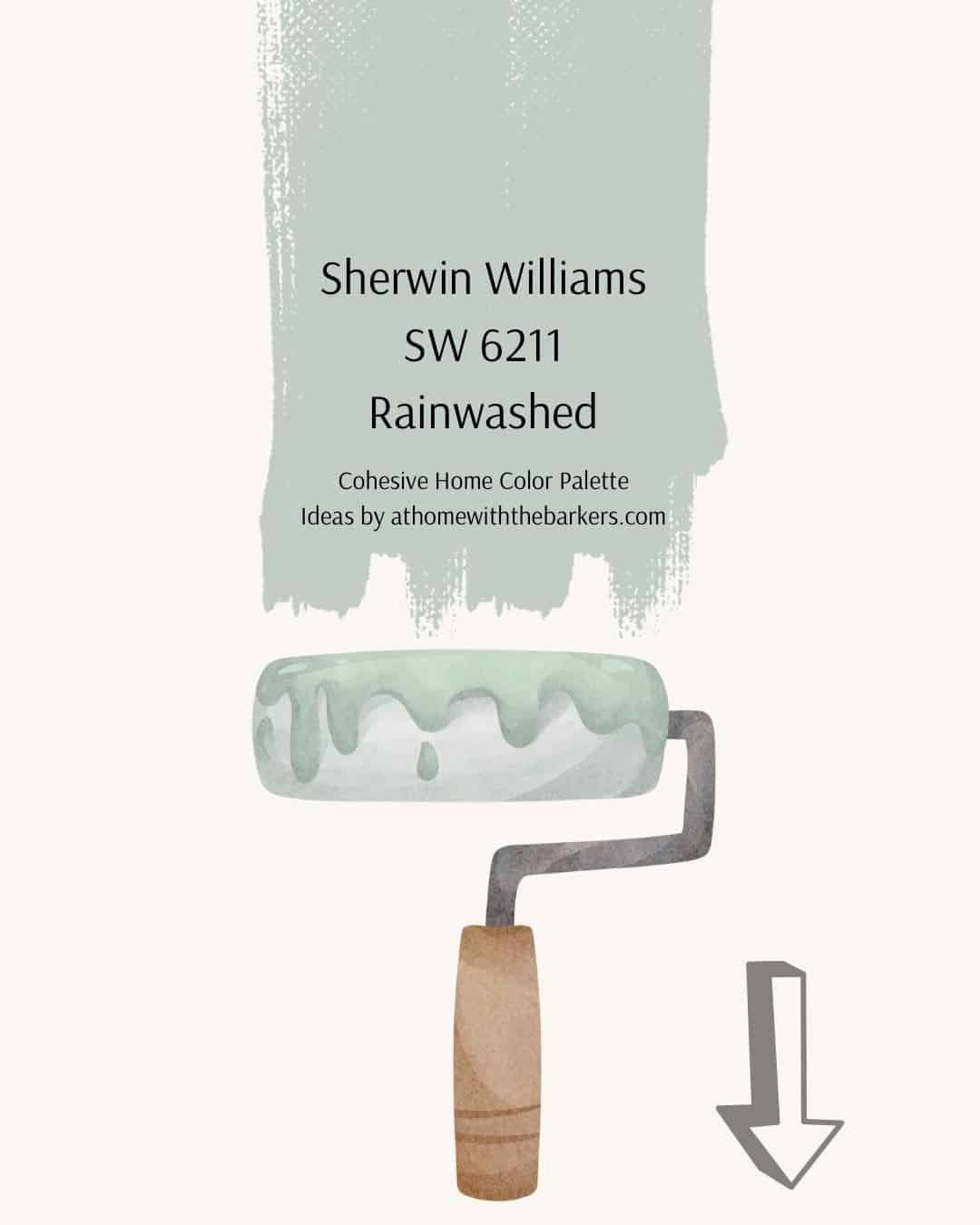
If you’re looking for a paint color that feels both refreshing and peaceful, Sherwin Williams Rainwashed might be the one. This captivating blend of blue and green creates a tranquil backdrop, perfect for serene bathrooms, cozy bedrooms, or adding a gentle touch of color to your kitchen.
This post may contain affiliate links. See our disclosure for full details.
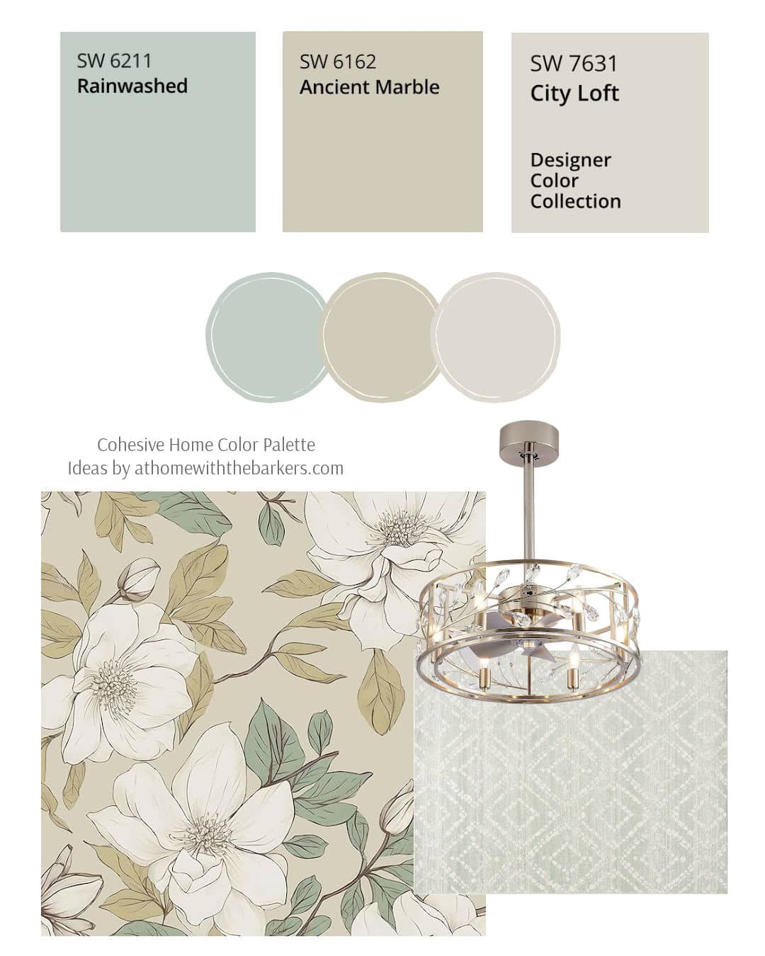
SHOP all of the rugs and wallpaper in these design boards.
What Color is Sherwin Williams Rainwashed?
At first glance, Sherwin Williams Rainwashed (SW 6211) looks like a light and airy blue-green, but spend a little time with it and you’ll see how gracefully it shifts with the light. This serene, nature-inspired color brings a calming presence to any room.
In bright spaces, Rainwashed leans fresh and coastal; in dimmer light, it softens into a cool, soothing green that feels tranquil and timeless.
It’s an ideal choice for creating a relaxing retreat in bedrooms, bathrooms, or even a welcoming entryway. To see how it truly feels in your home, try a sample on the wall or use a peel-and-stick option to move it around and test it with your lighting and décor.

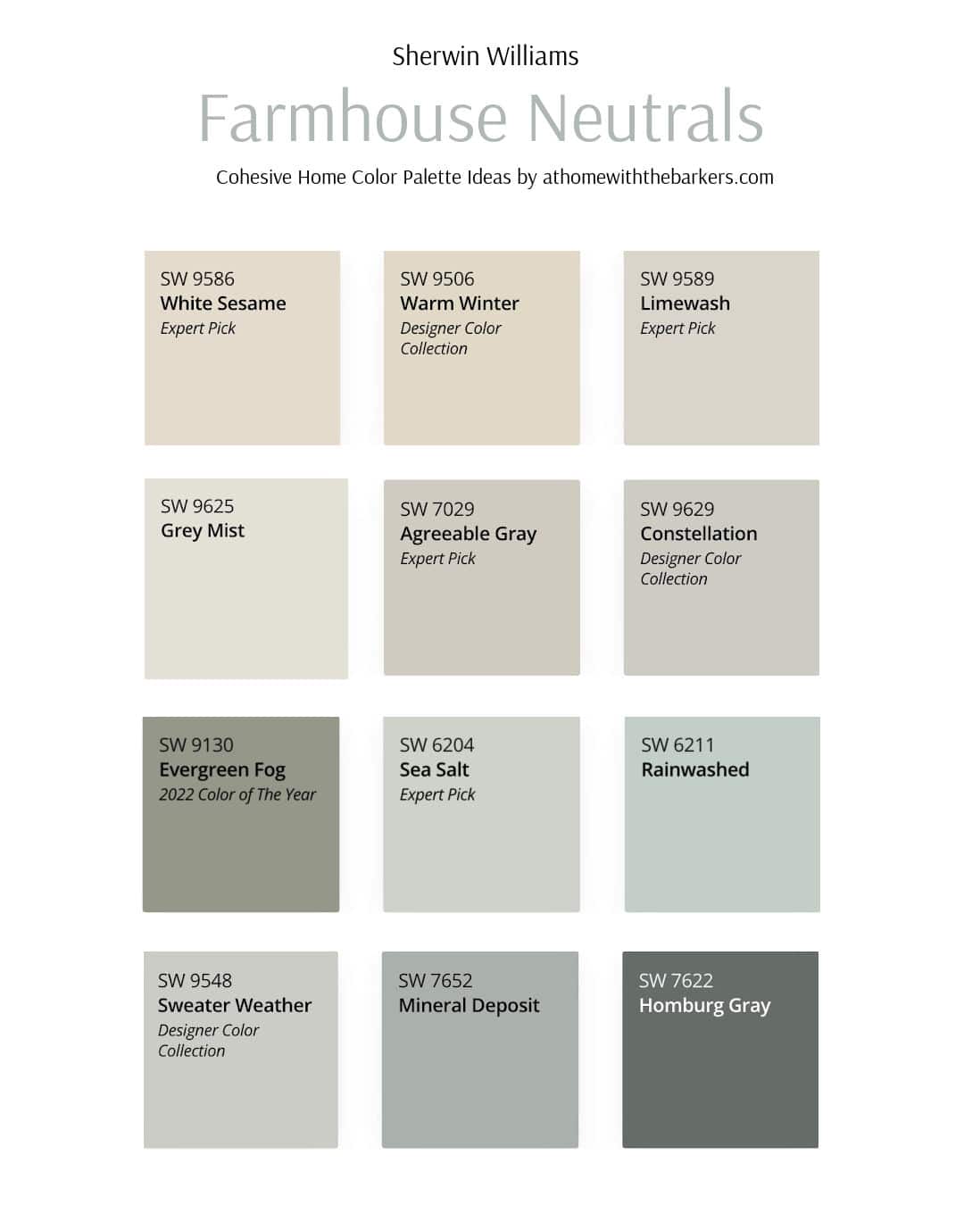
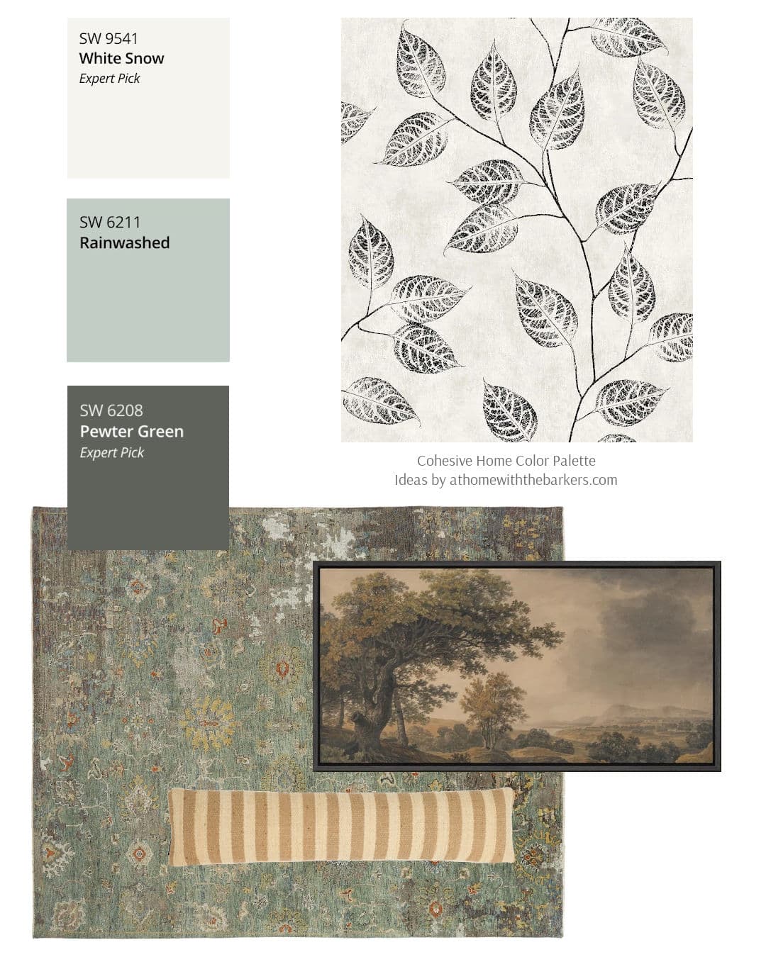
If you loved my post on Sherwin-Williams Sea Salt or Sherwin Williams Evergreen Fog, you’re in for a treat with Rainwashed (SW 6211). Think of it as Sea Salt’s slightly deeper, more dynamic cousin. Scroll this post to find the design board that speaks to you the most.
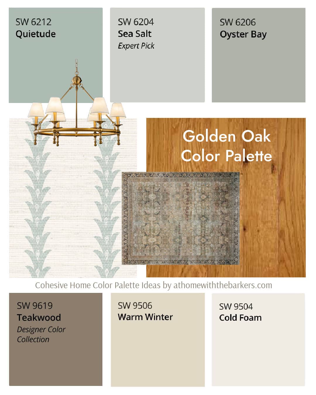
I also love it as an option for your honey oak and golden oak floors.
Handy Tip
If saving money and starting a project fast is your style, learning how to paint a room from top to bottom is a skill you’re going to want to know. Even if you are a beginner, knowing how to paint a room is the best way to a new look quick.
Rainwashed Undertones and Light Reflectance Value
- Undertones: Light and airy blueish green
- LRV: 59
With an LRV of 59, Sherwin Williams Rainwashed is considered a light color that reflects a good amount of natural light. It feels bright and airy without being stark or overly pastel.
In rooms with plenty of sunlight, Rainwashed will appear soft and breezy with a gentle blue-green glow. In spaces with limited light, it shifts slightly cooler, showing more of its blue side while still maintaining that calm, serene feel it’s known for.

Mixing Rainwashed with SW Iron Ore, a cool, deep and mysterious charcoal, will keep your space from feeling to light and airy.
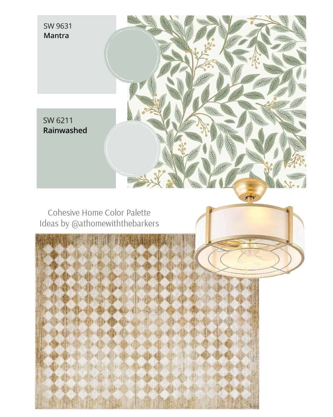
Coordinating Colors for Rainwashed
These are what SW lists as coordinating colors to Rainwashed. They can work as well as all of the design board options I’ve created here for you.
- Window Pane (SW 6210)- a bright and playful blue-green pastel
- First Star (SW 7646)- a clear, cool white with a hint of gray
- Pewter Cast (SW 7673)- A cool, neutral gray with purple undertones

Don’t Skip These: You will want to check out my paint sheen guide and full home paint color inspiration before your next paint project.
Where to Use Sherwin Williams Rainwashed
Rainwashed is great for most all of your spaces.
- Bathroom
- Bedroom
- Nursery
- Open concept spaces
- Entryway
The large art piece over a bed or sofa would look amazing.
Tips for Sampling Rainwashed
Because this color is ever changing, I always recommend testing a swatch in your home. Here are a few tips.
- Paint a poster board, leaving a white edge of about 2-4 inches and move it around the room
- Look at it in morning, afternoon, and evening light
- Hold it next to your floors, cabinets, and upholstery to see how undertones shift
Final Thoughts
Rainwashed’s soft, airy blend of blue and green makes it a timeless choice for anyone wanting a peaceful atmosphere without feeling too cold or too bold. Whether you use it in a bedroom, bathroom, or entryway, it brings a natural, refreshing touch that feels effortlessly serene.
Also, if you’re loving warm earthy colors, try this color palette.

Don’t skip this step!
The number one way to guarantee you get a paint color that misses the mark, is to skip the sample step. Don’t make that mistake.
Be sure to sample your paint colors.
If you go to Amazon. Com and put in at home with the Barkers in the search, you can find their storefront. You can look for the wallpaper as well as other things they show.
Hello, I saved a post of one of your pictures on Pinterest using the Sherwin Williams paint colors Rainwashed. Two of the colors that you paired it with were Naval and Extra White. I love the floral wallpaper that you show with it. Could you tell me where to find that wallpaper?