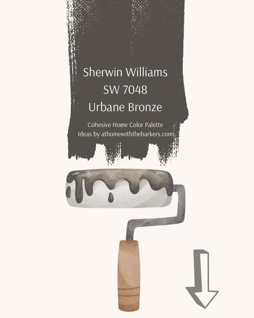
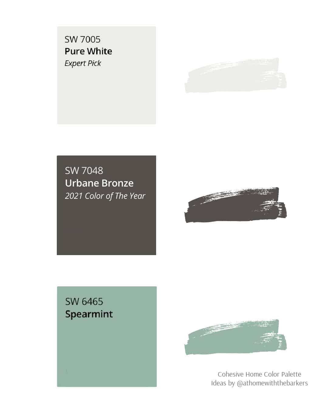
Sherwin Williams Urbane Bronze
Discover Sherwin Williams Urbane Bronze (SW 7048), a brownish gray that reflects both nature and subtle sophistication. Learn about its undertones, coordinating colors, and see how to style this versatile shade throughout your home with designer mood boards.
If you’re looking for a paint color that feels both moody and sophisticated, Sherwin Williams Urbane Bronze might be the one. This captivating blend of brown and gray creates a tranquil backdrop, perfect for living rooms, bedrooms, or offices.
This post may contain affiliate links.
Table of contents
What Color is Sherwin Williams Urbane Bronze?
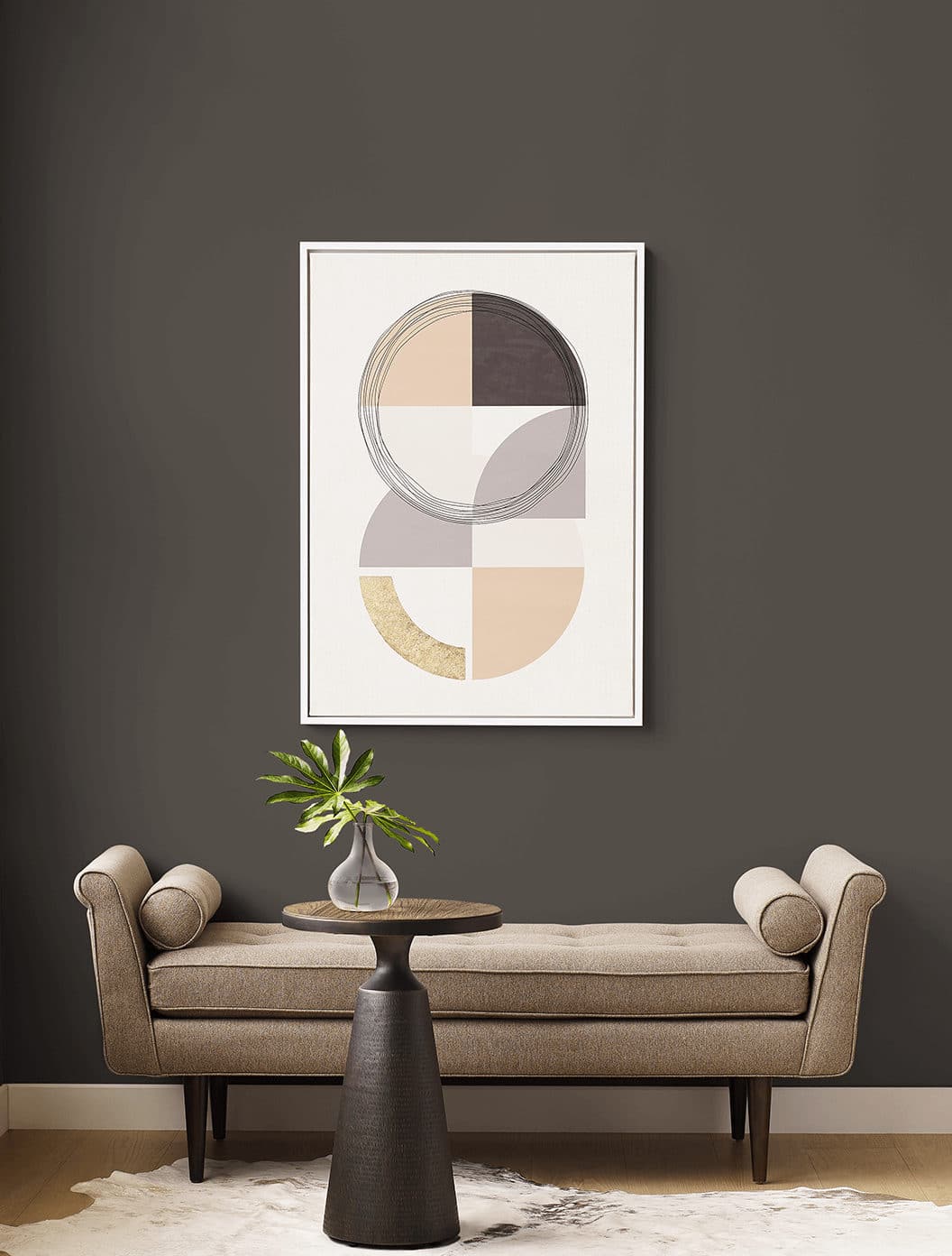
At first glance, Sherwin Williams Urbane Bronze (SW 6211) looks like a classic brown, but spend a little time with it and you’ll see the gray undertones. This serene, nature-inspired color brings a calming presence to any room.
In spaces with limited light, it leans more dramatic and charcoal-like. In bright spaces, Sherwin Williams Urbane Bronze takes on a softer, more refined look. The natural light brings out its warm brown undertones, giving the color a velvety, organic feel rather than appearing flat or overly dark.
Shop this design with honey oak floors
It’s an ideal choice for creating a moody retreat in the living room, bedroom or office. To see how it truly feels in your home, try a sample on the wall or use a peel-and-stick option to move it around and test it with your lighting and décor.
Urbane Bronze Undertones and Light Reflectance Value
Undertones: Brownish gray, LRV: 8
With an LRV of 8, Sherwin Williams Urbane Bronze is a deep, moody color that absorbs more light than it reflects, creating a rich and grounded atmosphere. Despite its darkness, it feels sophisticated rather than heavy, offering a perfect balance between warmth and depth.
In rooms with abundant natural light, Urbane Bronze reveals subtle brown and gray undertones that give it a cozy, earthy elegance. In spaces with limited light, it leans more dramatic and charcoal-like, enveloping the room in a cocoon of calm and modern refinement.
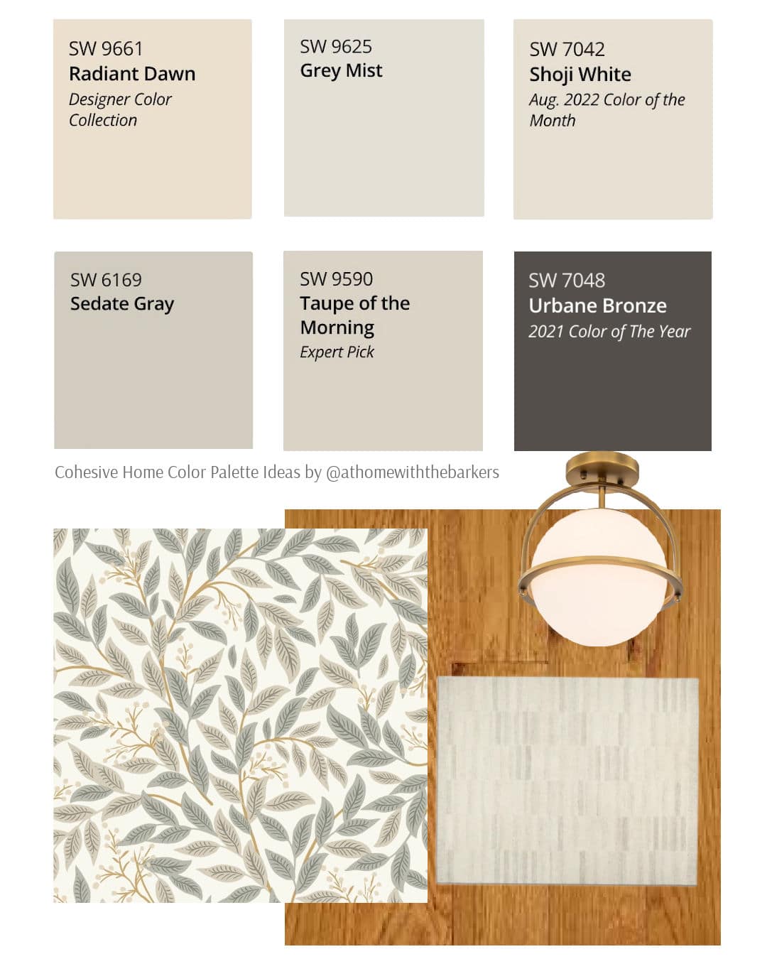
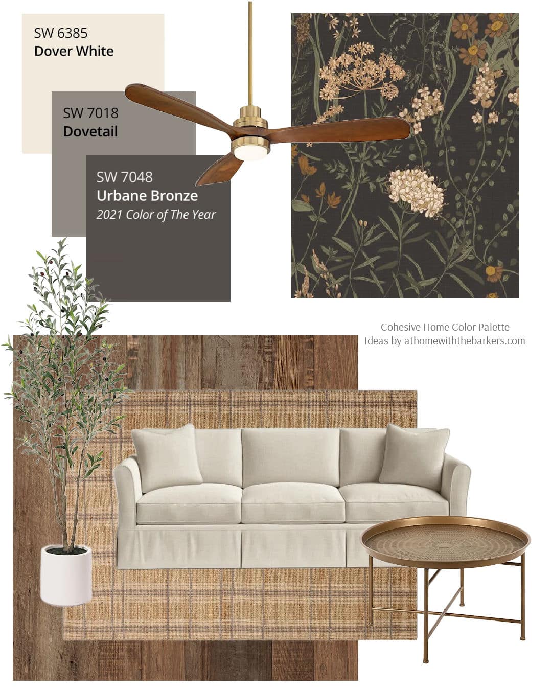
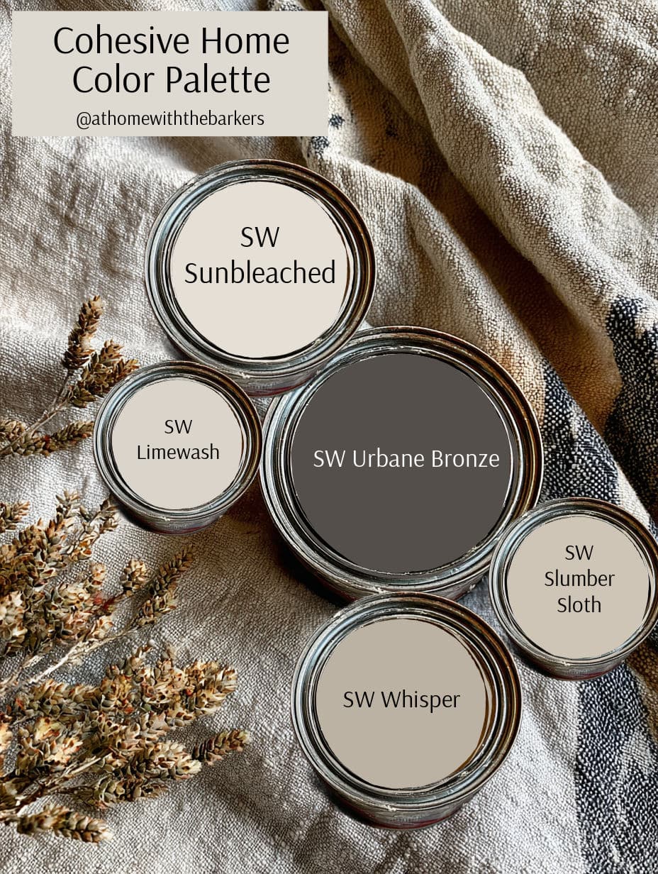
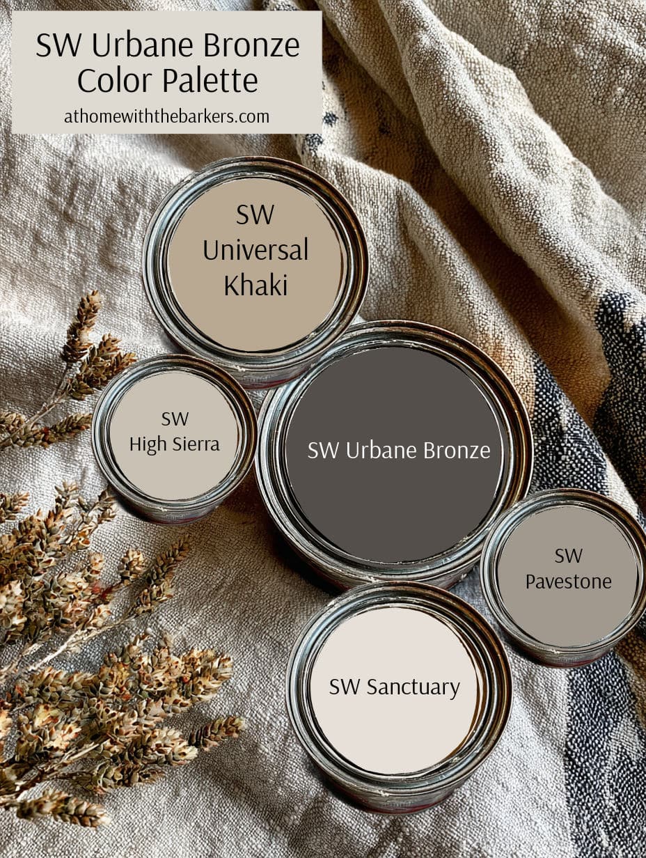
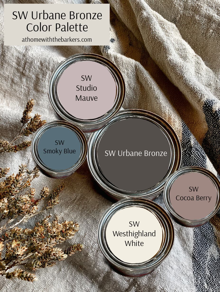
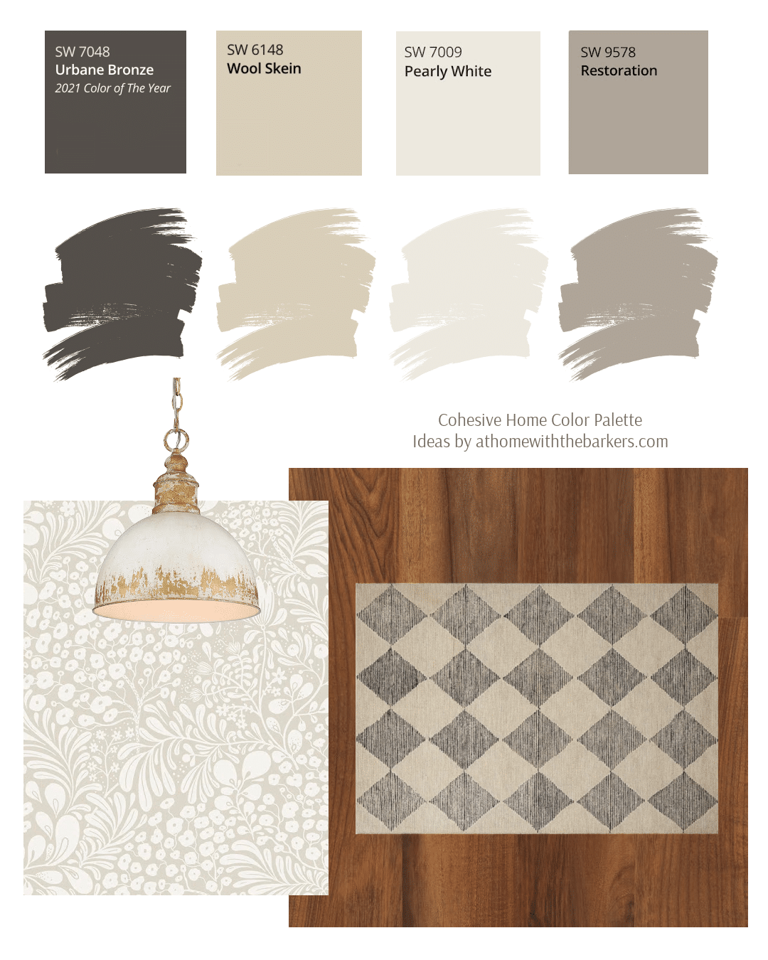
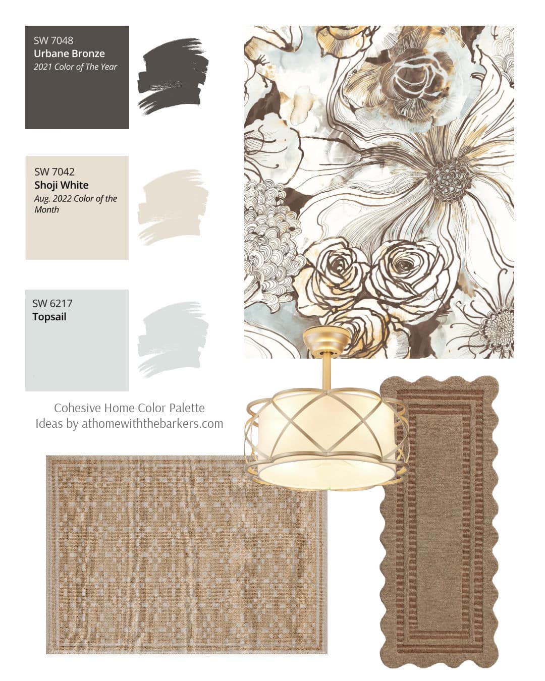
Coordinating Colors for Urbane Bronze
These are three of the recommended colors to pair with Urbane Bronze but there are so many more options.
- Shoji white (SW 7042) – a warm, creamy white that borders on greige
- Extra White (Sw 7006) – a clean and crispy white
- Ivoire (SW 6127) – A light, creamy tone with a warm glow

Where to Use Sherwin Williams Urbane Bronze
Urbane Bronze is great for statement spaces or intimate rooms such as
- Bedroom
- Dining Room
- Office/ Library
- Powder Room
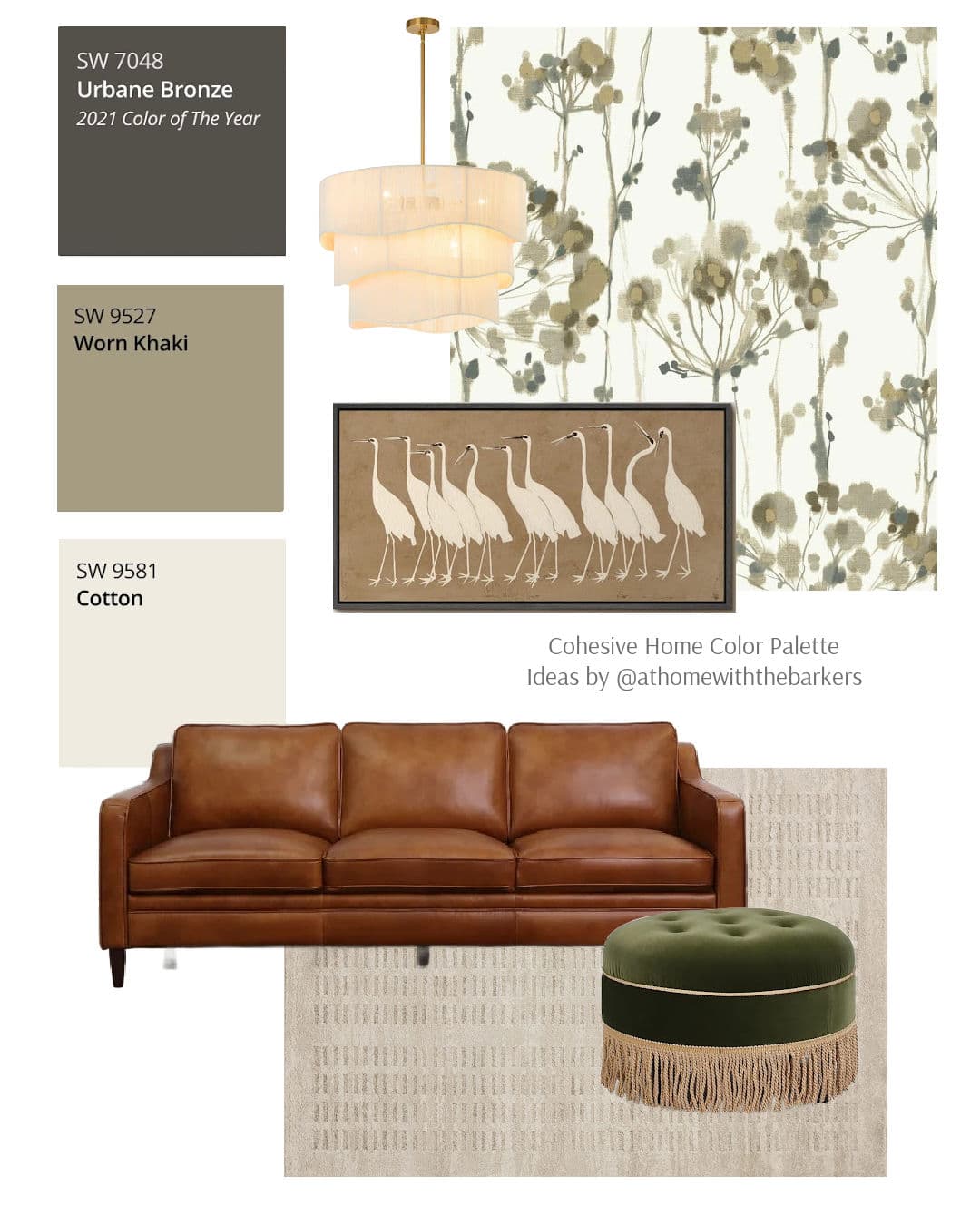
Shop the neutral design board above.
Tips for Sampling Urbane Bronze
Because this color is deep and moody, I always recommend testing a swatch in your home. Here are a few tips.
- Paint a poster board and move it around the room (leaving a 2-4 inch white edge)
- Look at it in morning, afternoon, and evening light
- Hold it next to your floors, cabinets, and upholstery to see how undertones shift
You can paint samples directly on the wall or use the peel and stick paint sample. I highly recommend the peel and stick. It’s real paint, a large size and you can move it from room to room. If you want to learn how to paint a room top to bottom I got you.
Don’t skip this step!
The number one way to guarantee you get a paint color that misses the mark, is to skip the sample step. Don’t make that mistake.
Be sure to sample your paint colors.
Final Thoughts
Urbane Bronze’s rich mix of brown and gray tones makes it a timeless choice for those who love depth and sophistication in their spaces. It brings a sense of warmth and stability while still feeling modern and refined.
If you have any questions or need help choosing coordinating colors, feel free to comment or reach out. I’d love to help you create a home that feels calm, cohesive, and truly yours.